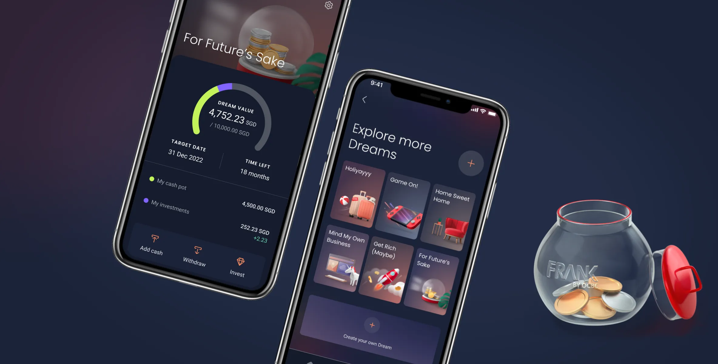
FRANK by OCBC
A digital banking experience for customers new to the workforce and entering the adulting stage
A digital banking experience targeted at customers who are new to workforce and entering the adulting stage. The FRANK app focuses on purpose led banking where customers can portion or grow their savings depending on their dreams.
MY ROLE
- Key communicator: Led CX communication across platform, agency, and dev teams; ran Agile ceremonies including sprint planning, backlog refinement, and retrospectives.
- Design: Directed the design agency on flow and UI, and led illustration concepts for key visuals.
- Research: Partnered with the Journeys team's research labs to synthesise findings and identify personas, improving the overall banking experience for different types of users.
- Cross-squad alignments: Ran weekly internal reviews to keep other squads in sync.
- Development: Delivered handoff specs, ran desk checks for a stable build, and logged/briefed devs on defects.
Feature objective
When a user sets up a Dream, they can set their own milestones, goals and achievements. As the lead designer on the Dreams feature, my scope mainly focused on the experience for a customer to engage with the product and journey.
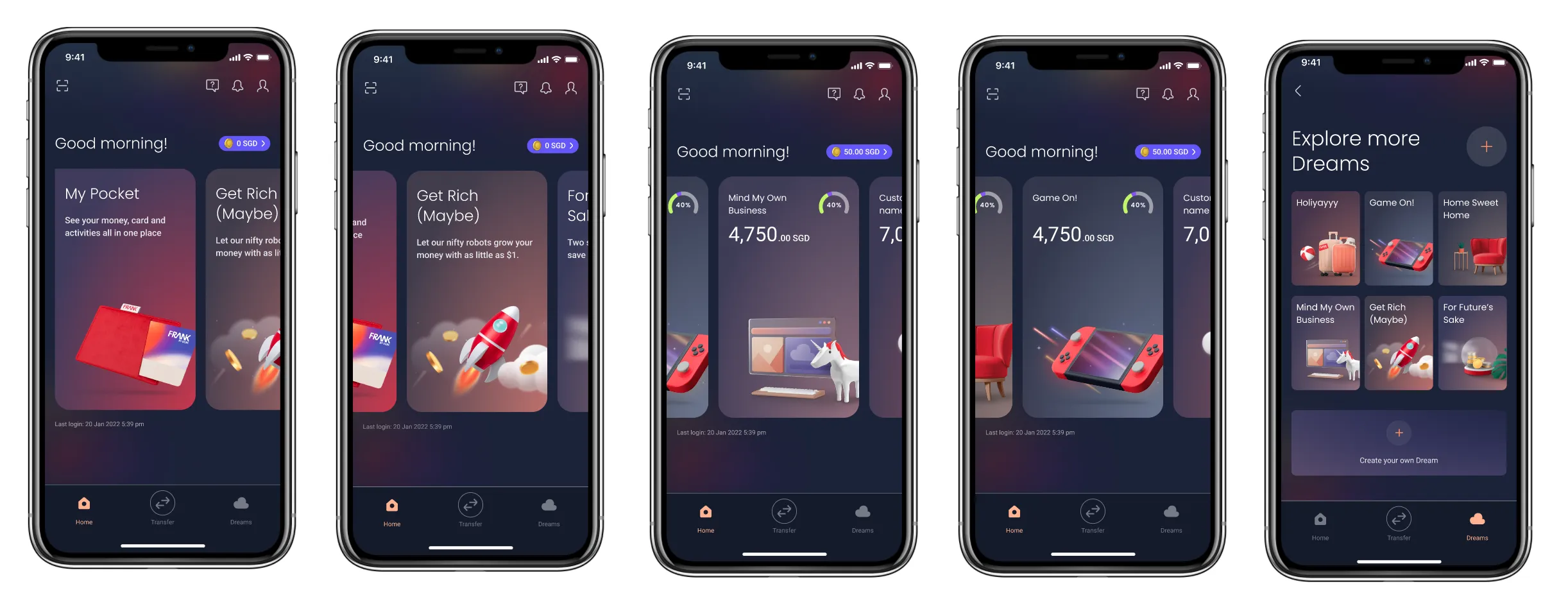
The Dream unit
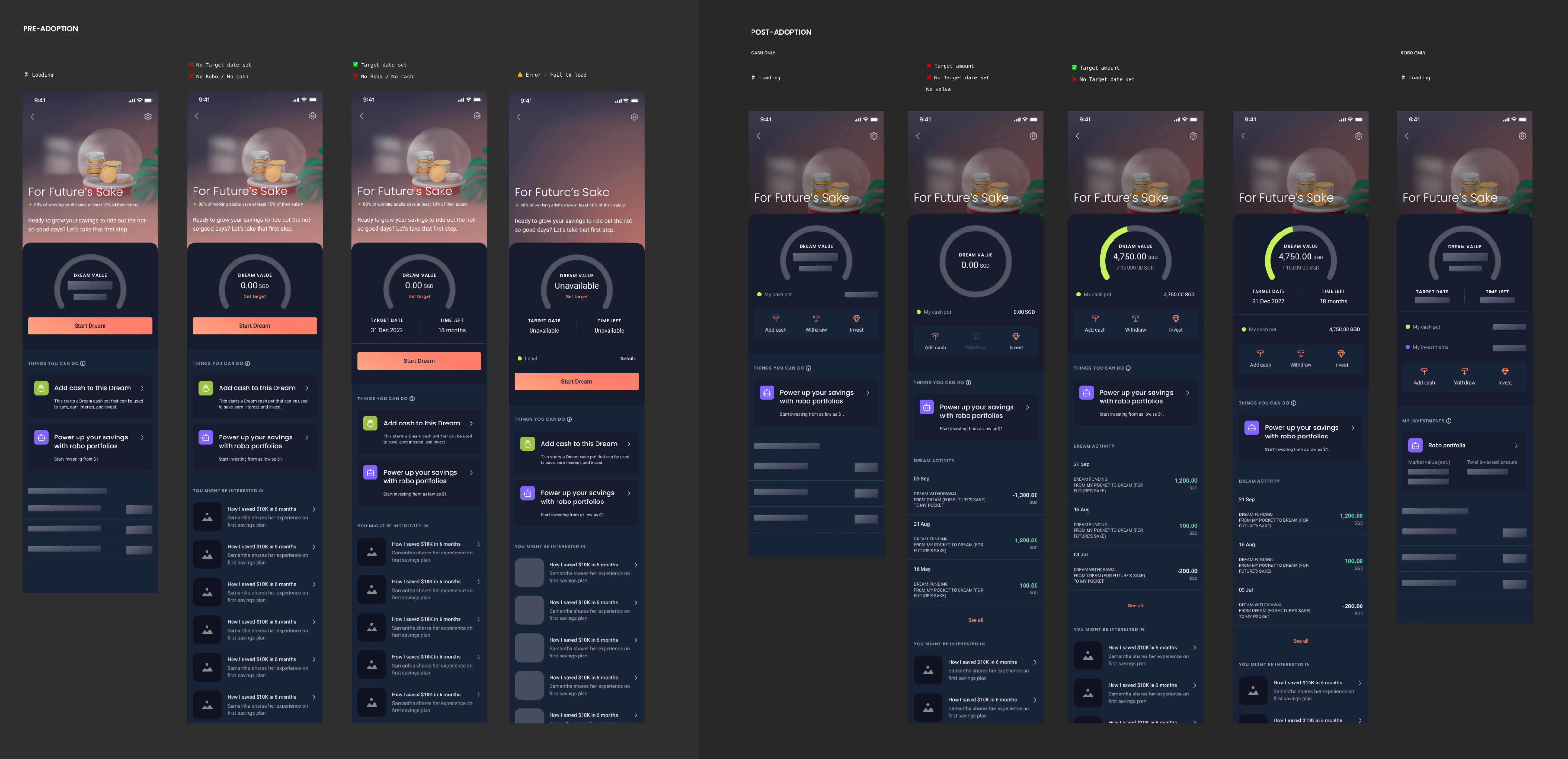
Dreams is a modular goal-setting feature, so we created a flexible template to handle different goals, images, and content. The layout adapts dynamically based on the data shown to users. Visualising the UI from the first to second level of the user journey in all states helped ensure everything was covered.
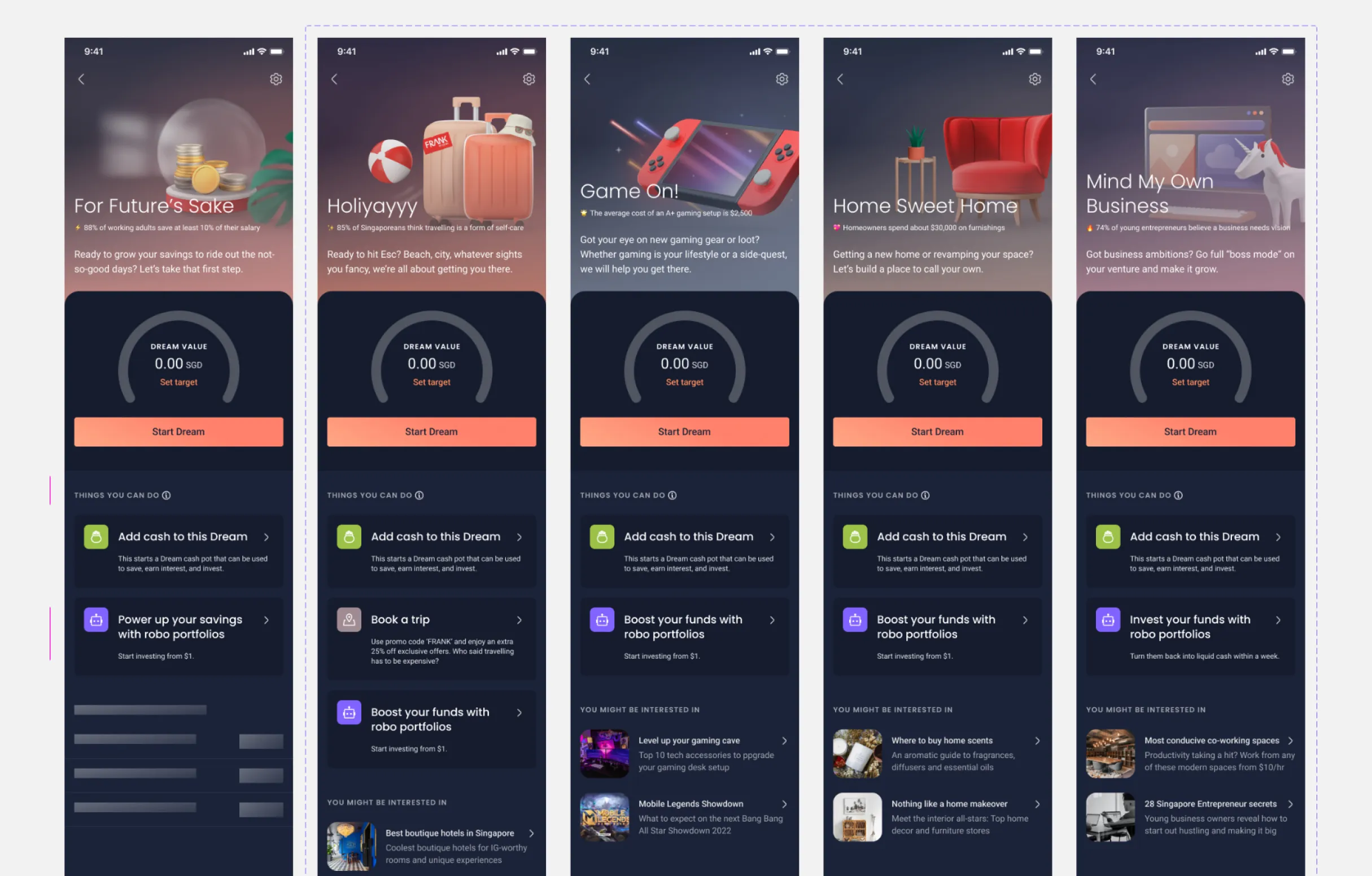
Other Dream templates with contextual content
What customers could do with dreams
The concept of dreams was to allow customers to set aside funds to save up for something -- this could be any goal they have set in mind.
There were templates that they could choose from, so the list of default selections had to be generic and highly relatable.
Through user testing we were able to understand what most of our target audience could be drawn to.

Customisable Dreams
The option for users to upload their own image as a Dream masthead came directly from user testing. Customers shared that being able to personalise their Dream made the goal feel more meaningful—and achievable.
To support this, we needed to account for how user-uploaded images would interact with the rest of the content. We designed a flexible template with a gradient overlay to ensure text remained legible across different image types.
This was tested against a range of images with varying contrast and visual noise.
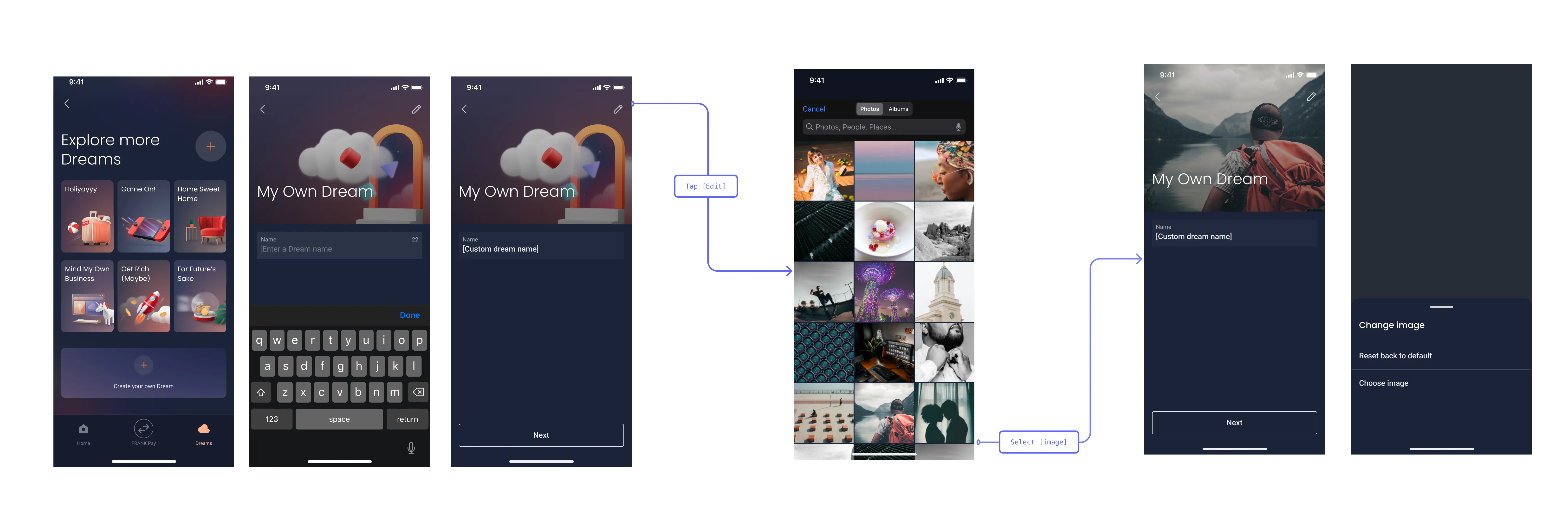
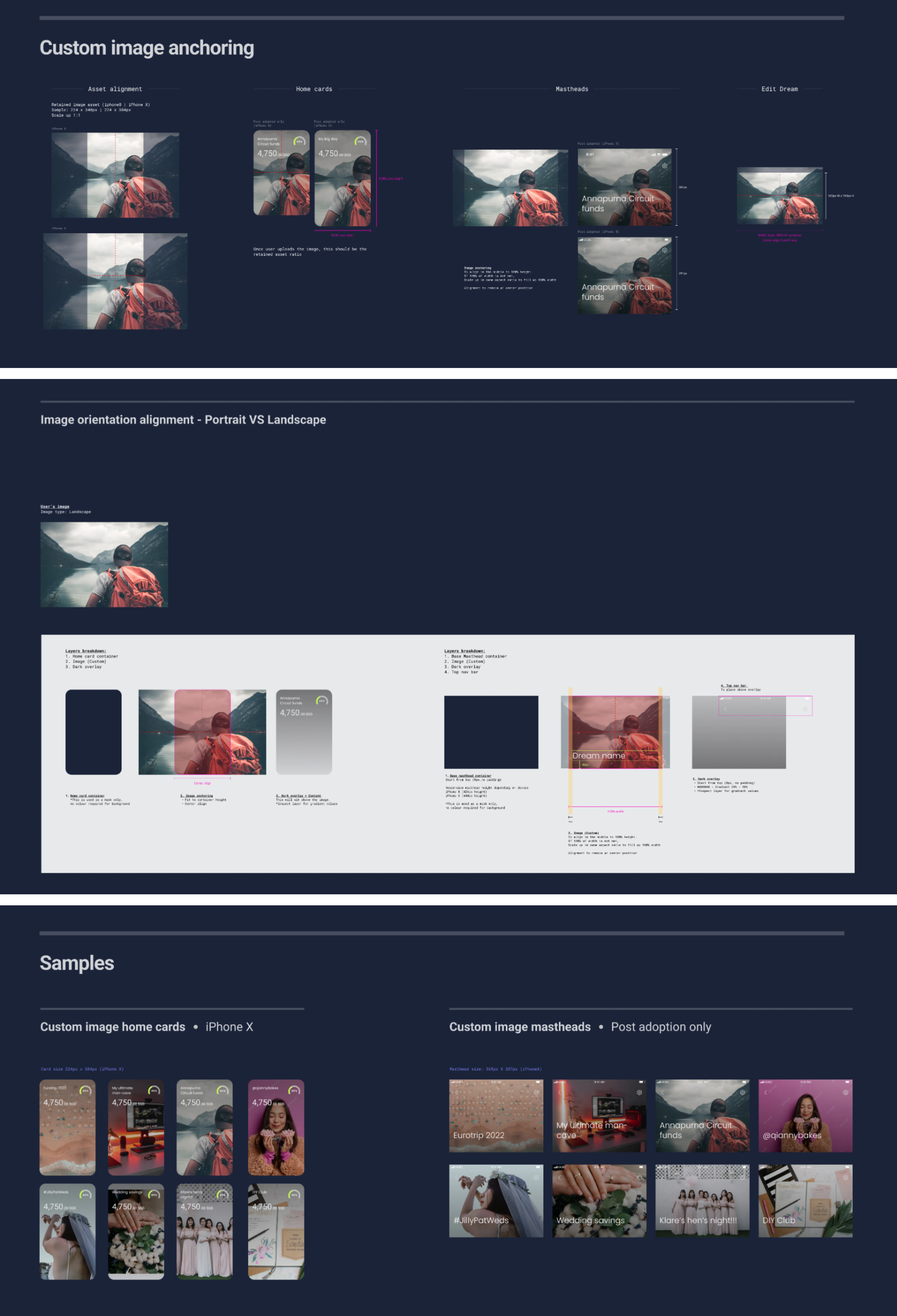
Illustration & Art Direction
KEY OBJECTIVES
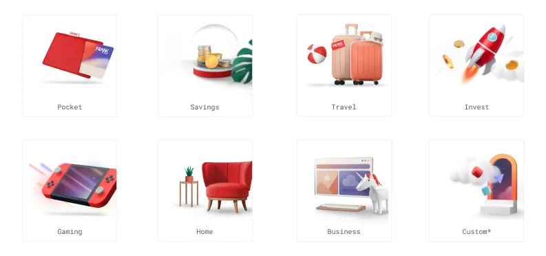
We used vibrant 3D-style illustrations to make the content more fun and relatable for a younger audience. These visuals made setting up goals more exciting and helped make each Dream easier to understand.
Defining colours and emojis
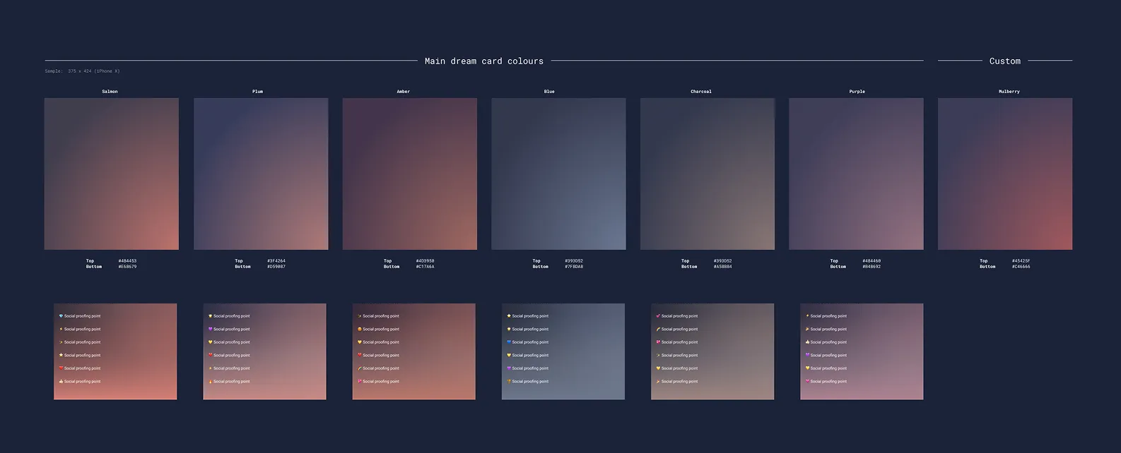
To maintain visual clarity across light and dark modes, we curated background colours that complemented the illustrations. We also curated a set of emojis to ensure consistency and harmony within the template.
Documentation
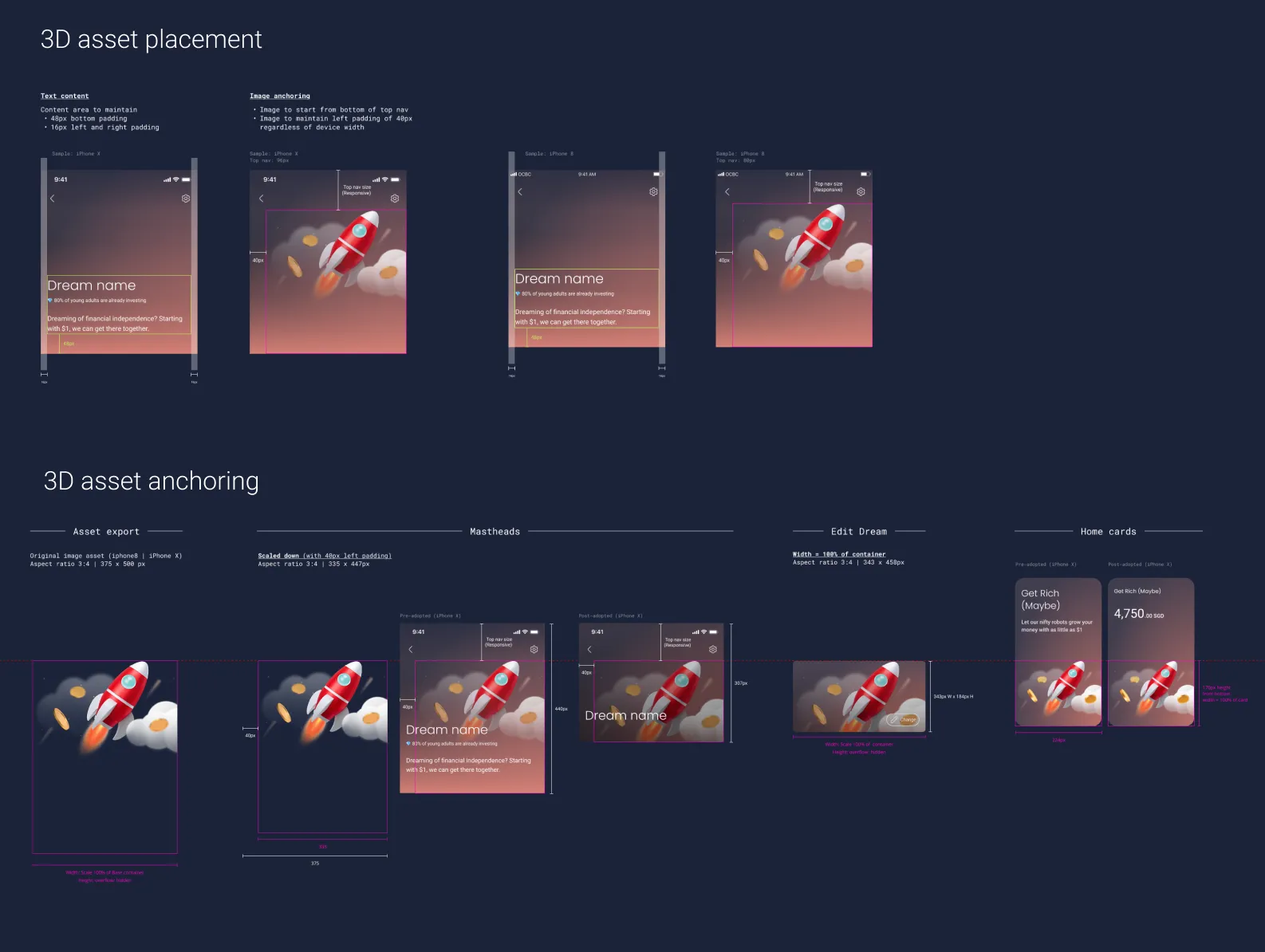
With multiple visual states and dynamic content across components, we created thorough guidance to support consistent implementation.
It covered how to apply the template, adapt it for different use cases, and keep design and development aligned.
Project status & learnings
This project was eventually shelved very close to launch as the business shifted focus in a different direction.
Key learnings:
- How to stay flexible when business goals change.
- The importance of using user feedback early to shape better features.
- How to work smoothly with engineers, designers, user researchers, and vendors to keep everyone on the same page.
- Understanding technical limits to create practical designs.